
Charts help to make various graphical representations visually impressive. In Excel, the visual representation of your data story will determine how well your presentation is received. But, where will you visualize data in Excel?
Here’s what you need to do:
1. Error-free spreadsheet
The first thing to ensure is to keep the excel sheet free from errors. Make sure that the format is correct.
2. Use combination charts
Clustered column charts are often difficult to understand because when you visualize them, all you see are figures that represent a few data sources, but they don’t really convey the message clearly. That is why it is better to use combination charts instead of radical bar charts. This will also make the excel sheet look more appealing.
- Under Chart Tools, you will find the Design tab.
- Click on the Change Chart Type. A dialog box will appear where you need to click on Combo. You will find several types of charts with previews for each. Select Actual to Line with Markers.
- Your excel sheet will now have a different chart, unlike the clustered column one. This is the customized combination chart that shows actual values marked along the lines. On the other hand, your target values will appear in the respective columns.
This is not only a way to visualize data in Excel correctly, but it also improves your skills on developing charts that look appealing, giving the viewers a clear idea about the message you want to convey through the spreadsheet.
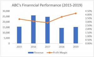

3. Use combination charts with a secondary axis
If you want to make the chart more detailed, you can add a secondary axis by including another variable. For example, if you are calculating profits for a period and comparing it with the amounts of previous financial years, the combination chart will be apt. But, you also need to include the number of units sold in this report. This calls for the secondary axis. It allows the primary axis and a secondary axis to display different ranges.
- Find the Insert tab and click on Combo from the dropdown list of Charts.
- Select the type of combo chart you want to make and click on Create Custom Combo Chart.
- Make sure you choose clustered columns to represent actual profits, line with markers to represent the number of units and click on the box for the secondary axis that will appear at the right of the line with markers.
- Unlike the previous chart that only showed the profit margins for different years, the new combo chart will show the number of units sold on its secondary axis.
These charts will give you a clear picture of what you want to represent in the spreadsheet. This is the type of data visualization that managers expect so that they don’t have to question about what different data stands for. Making an excel sheet full of data doesn’t mean it will look visually appealing. Try to follow the steps above to ensure you show more with less fluff.